
MAP MOSAIC: FROM QUEENS TO THE WORLD
PAPER MAPS
Paper maps were submitted from the private collection of members of the GISMO community, or were printed from digital files. These maps represent a wide range of themes including the diverse Queens neighborhood and demographics, urban planning, environmental studies, election analysis and more. A set of Halloween themed maps with parade routes and a scary “Crime of the Century” story will thrill ghouls of all ages.
We are interested in learning about the diversity of our visitors. Be sure to visit the National Geographic World Map and let us know where you were born.
Items with the following symbols indicate there is an interactive version available at the computer stations or that the mapmaker is also a speaker in our forum.
 Interactive Map
 Speaker
MAPS OF QUEENS
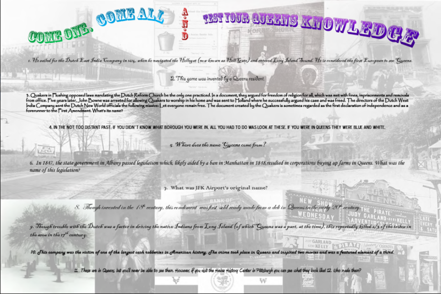 Come One, Come All And Test Your Queens Knowledge
By NYC Office of Emergency Management
Medium: Ink on paper
Dimensions: 30x 20 inches
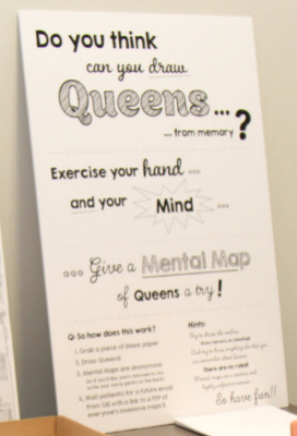 Mental Map of Queens
By NYC Office of Emergency Management
Medium: Ink on paper
Dimensions: 18 x 24 inches
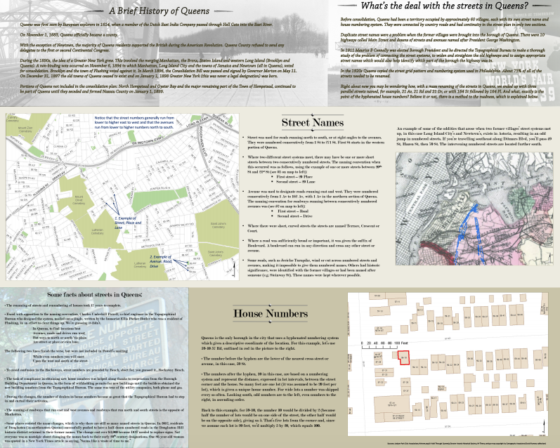 Queens Streets
By NYC Office of Emergency Management
Medium: Ink on paper
Dimensions: 40 x 32 inches
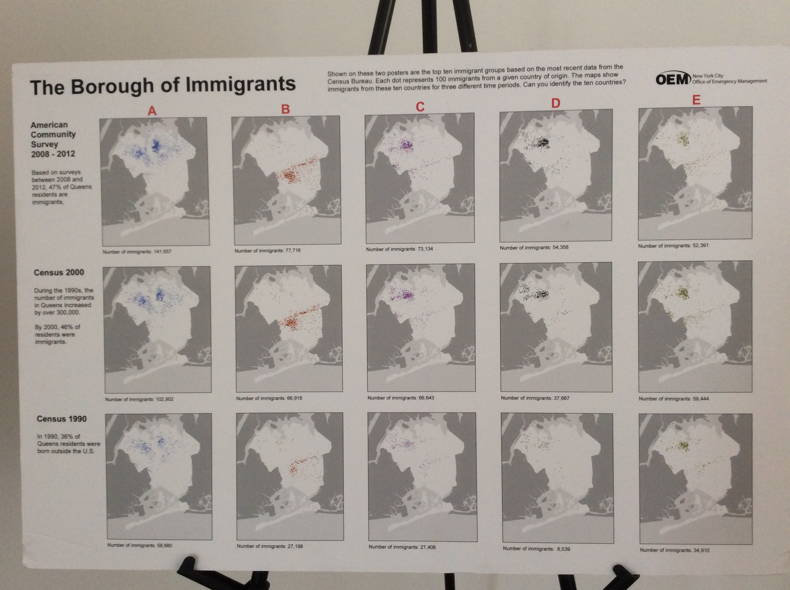 The Borough of Immigrants
By NYC Office of Emergency Management
Medium: Ink on paper
Dimensions: 18 x 24 inches
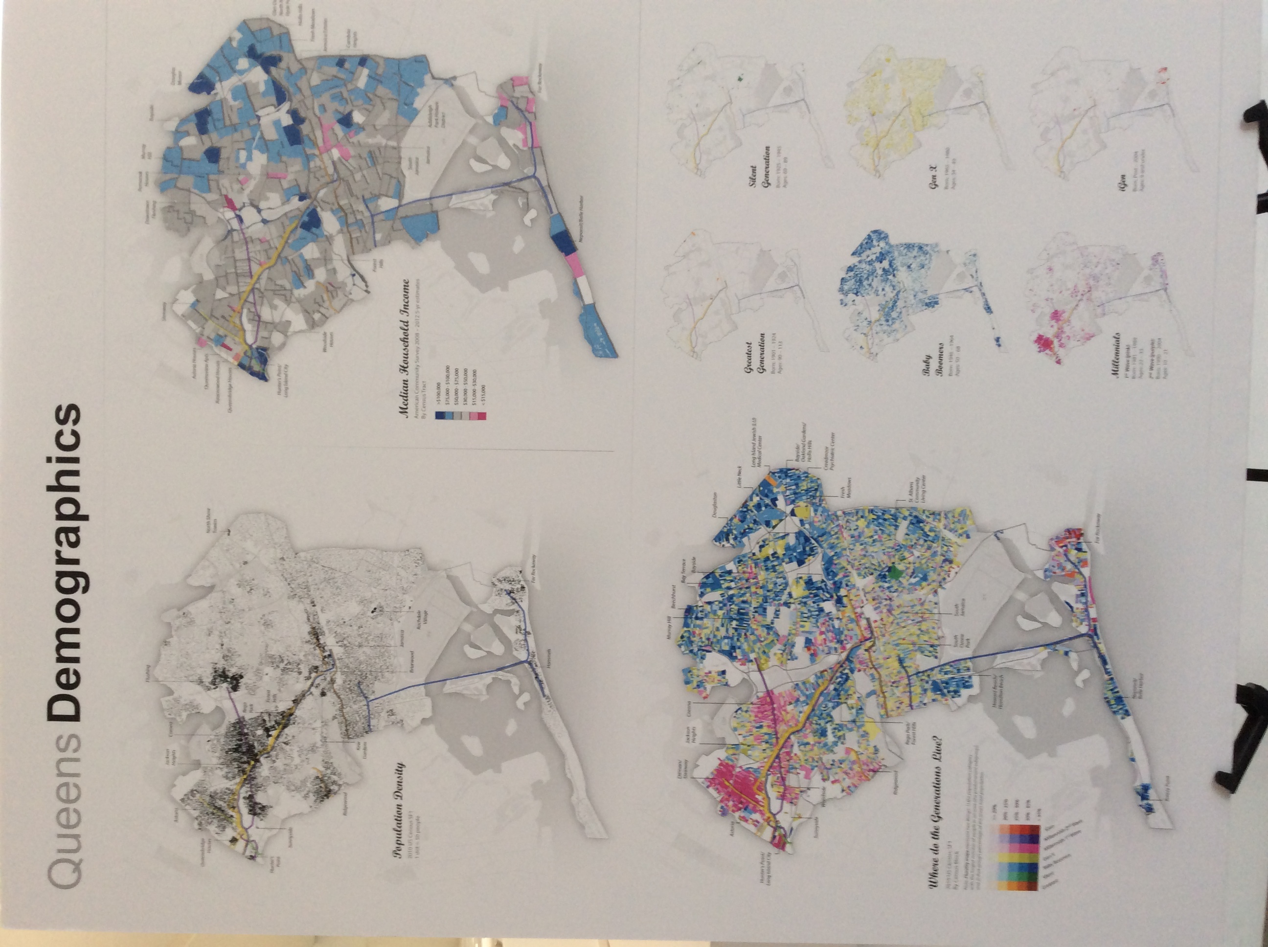 Queens Demographics
By NYC Office of Emergency Management
Medium: Ink on paper
Dimensions: 24 x 36 inches
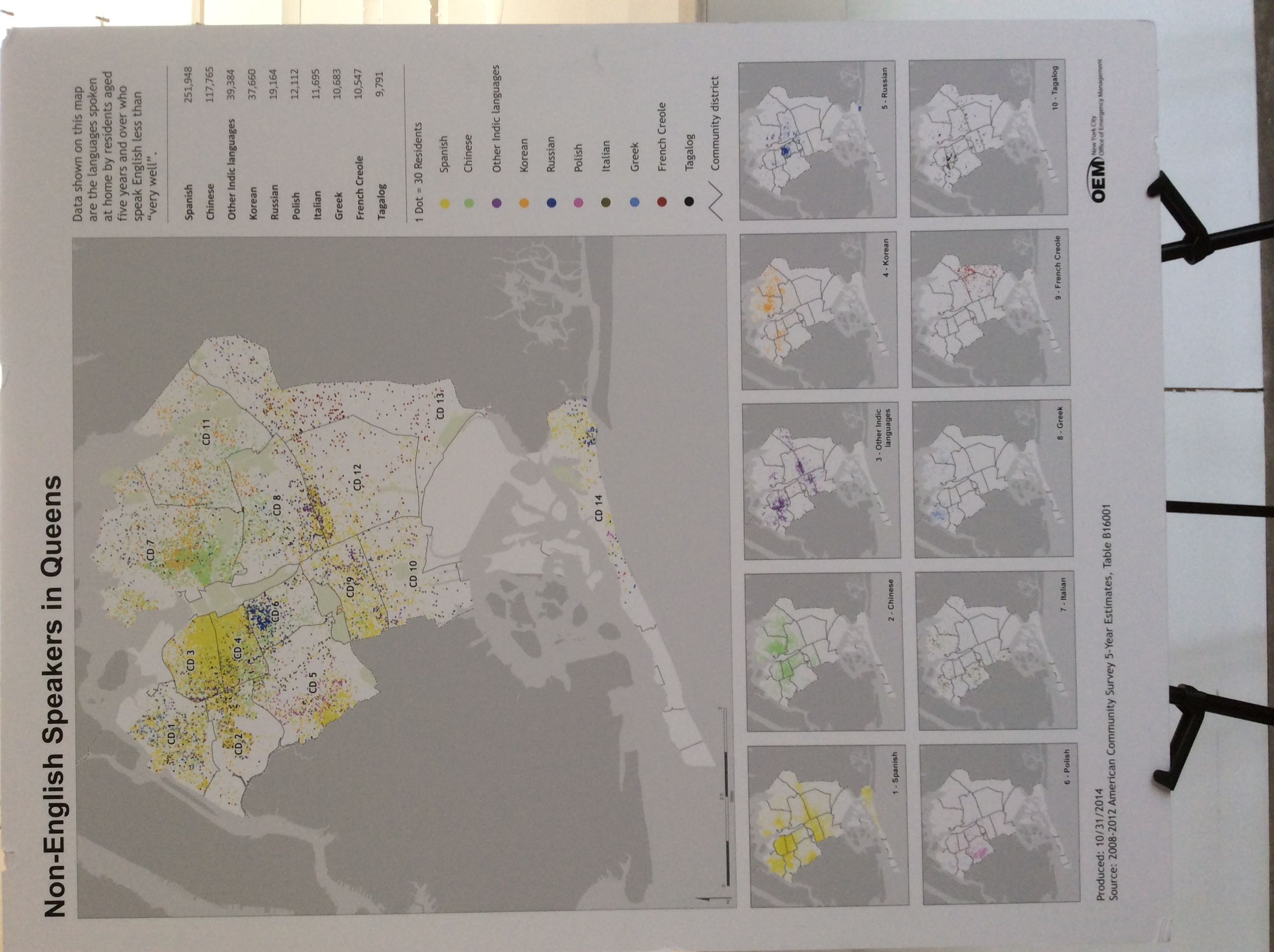 Non-English Speakers in Queens
By NYC Office of Emergency Management
Medium: Ink on paper
Dimensions: 24 x 36 inches
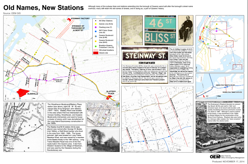 Old Names, New Stations
By NYC Office of Emergency Management
Created on November 17, 2014
Medium: Ink on paper
Dimensions: 30x 20 inches
HISTORICAL AERIAL AND GRID MAPS
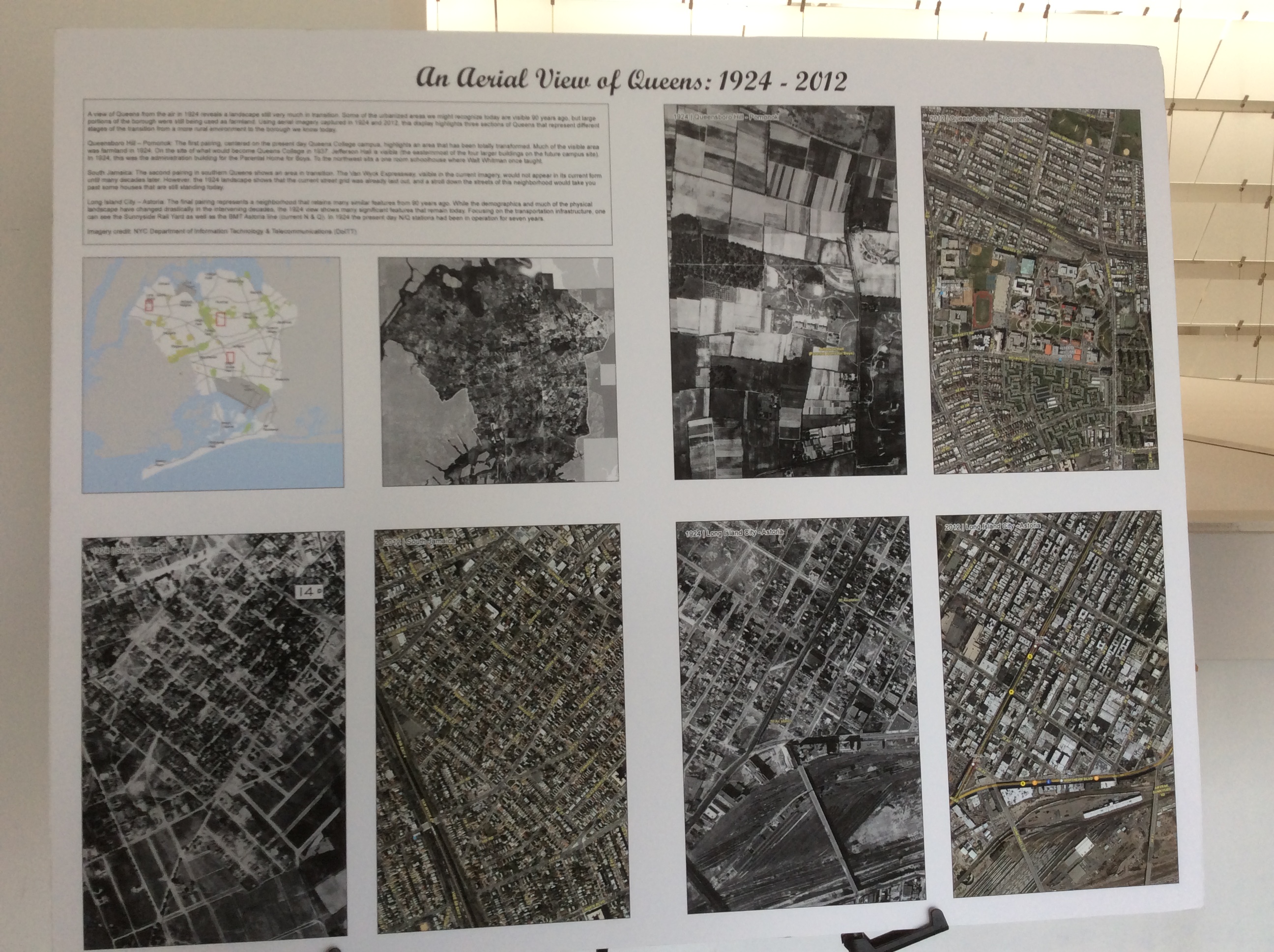 An Aerial View of Queens: 1924 – 2012
By NYC Office of Emergency Management
Medium: Ink on paper
Dimensions: 14 x 11 inches
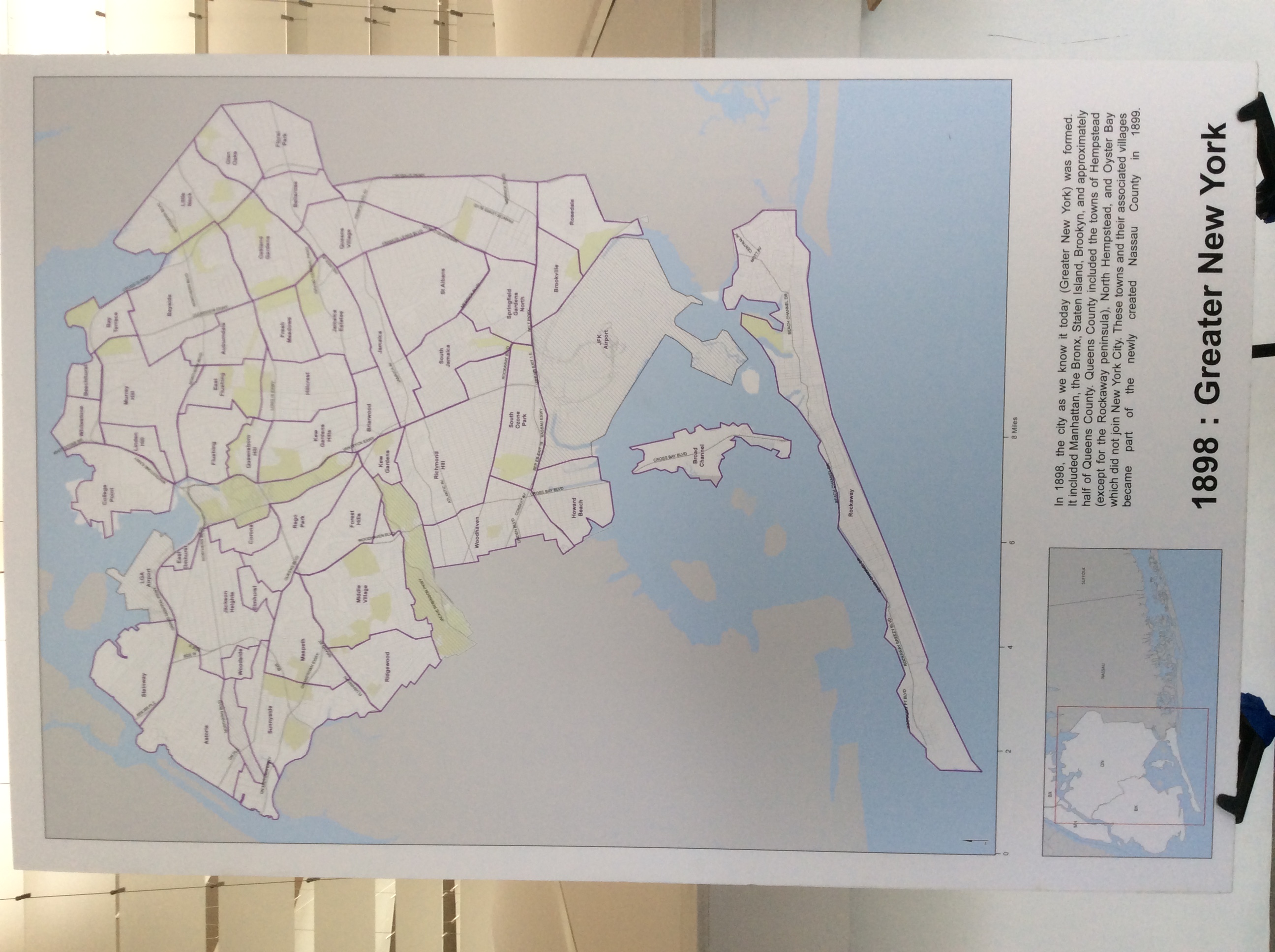 1898: Greater New York
By NYC Office of Emergency Management
Medium: Ink on paper
Dimensions: 20 x 30 inches
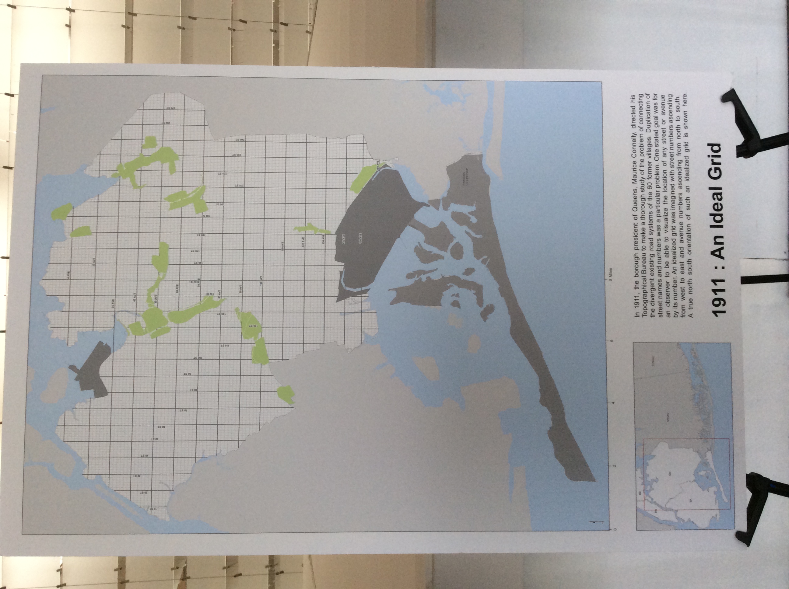 1911: An Ideal Grid
By NYC Office of Emergency Management
Medium: Ink on paper
Dimensions: 20 x 30 inches
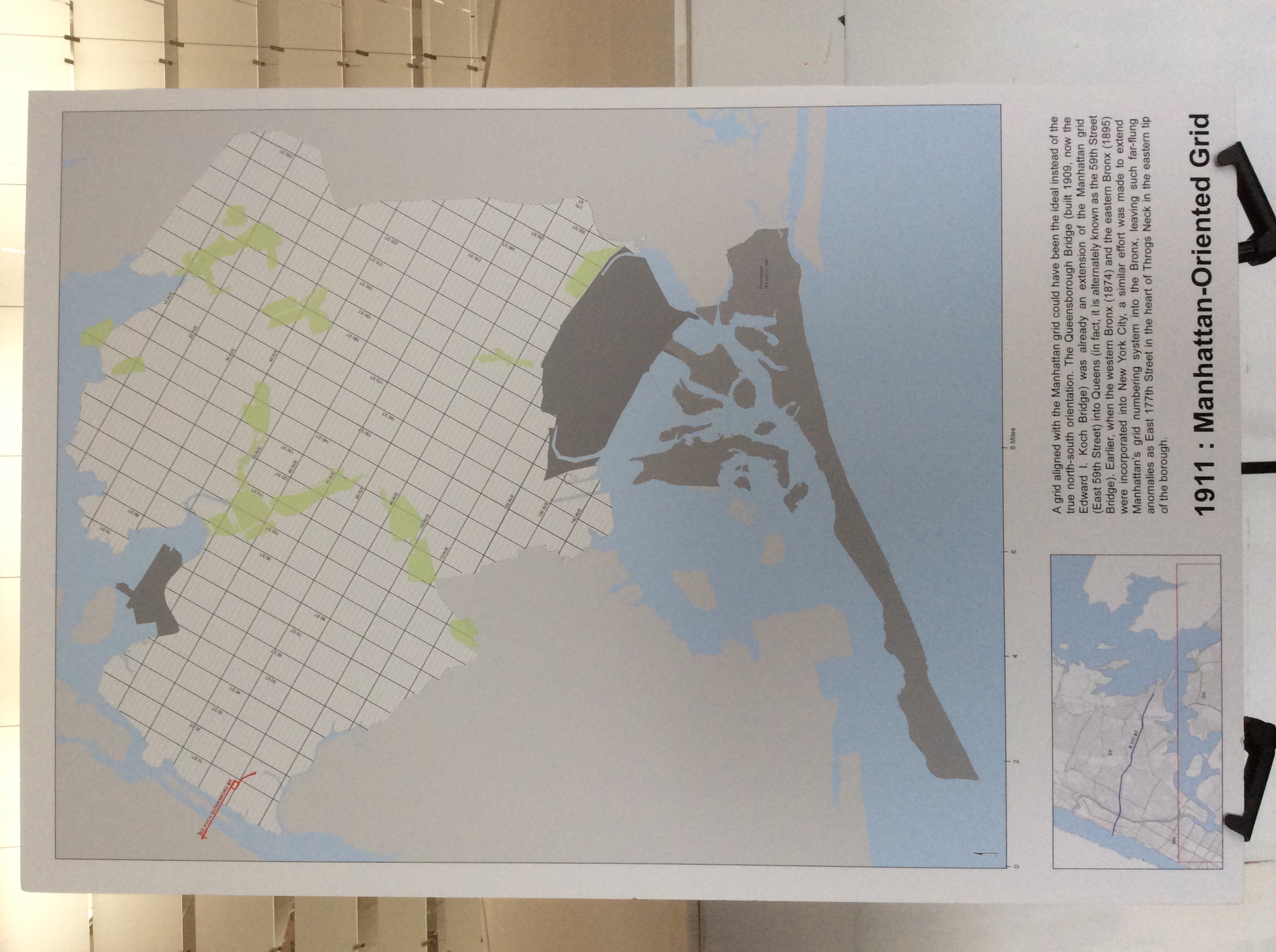 1911: Manhattan-Oriented Grid
By NYC Office of Emergency Management
Medium: Ink on paper
Dimensions: 20 x 30 inches
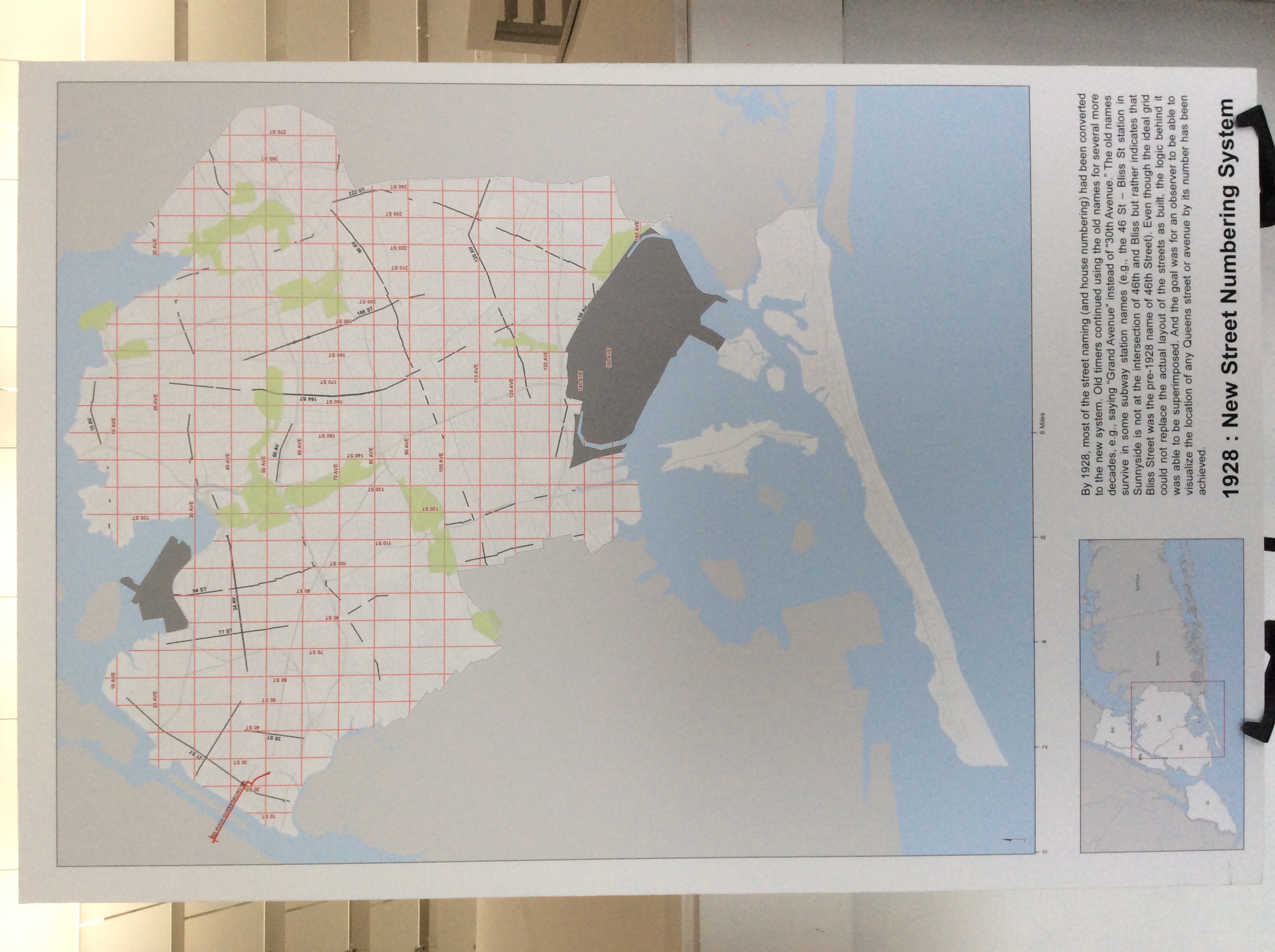 1928: New Street Numbering System
By NYC Office of Emergency Management
Medium: Ink on paper
Dimensions: 20 x 30 inches
ENVIRONMENT AND URBAN PLANNING MAPS
Lower Manhattan Viewshed Analysis 3D Models
from CyberCity 3D
By George Davis, Geoweb3d Inc.
Medium: Ink on paper
Dimensions: 10.2 x 5.3 inches
Resolution 120 dpi
Description: A 3D visualization of Lower Manhattan.
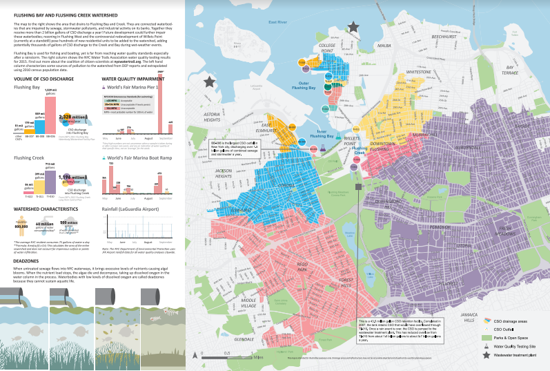 Flushing Bay and Flushing Creek Watershed (front)
By Korin Tangtrakul
Medium: Ink on paper
Dimensions: 18.4 x 12.4 inches
Resolution: 150 dpi
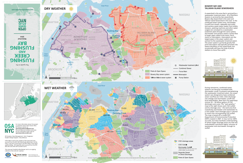 Flushing Bay and Flushing Creek Watershed (back)
By Korin Tangtrakul
Medium: Ink on paper
Dimensions: 18.4 x 12.4 inches
Resolution: 150 dpi
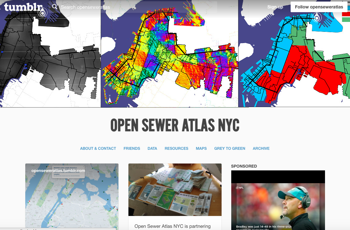 Open Sewer Atlas NYC
By Korin Tangtrakul
Medium: Interactive map
Website: http://openseweratlas.tumblr.com/
Description: This map shows the way sewage moves under normal conditions, and when it rains hard enough for the combined sewer system to overflow, and allow raw sewage and stormwater to enter the bay and creek. This map was made as part of the Open Sewer Atlas project.
Hurricane Sandy – Effect on Yellow School Bus Service
By Kevin Jenkins, NYC Department of Education, Office of Pupil Transportation
Medium: Ink on paper
Dimensions: 36 x 36 inches
Description: Details the extent and effects of storm surge on schools, bus garages and OPT’s office. Shows the steps taken to provide alternate service to alternate schools for students attending severely damaged public schools.
Languages of Queens
By Jill Hubley
Medium: Ink on paper
Dimensions: 35.48 x 37.4 inches
Description: This map depicts the predominant language in each census tract of Queens, excluding English and Spanish. This allows the viewer to see the wealth of diverse languages found throughout the borough.
Park Acres per 1,000 Residents in Detroit
By Alex Hill, DETROITography
Medium: Ink on paper
Dimensions: 11 x 17 inches
Description: Inspired by a WNYC project, this map was created by giving every census tract a half-mile buffer and then calculating how many acres of park space fell within those extended boundaries for each census tract. Those acres were then matched to the number of residents living within each census tract.
Some of Detroit’s more populated areas have much smaller parks. With more people and smaller park spaces that leaves fewer acres per person. Many people in the city benefit from Detroit’s many large parks, however the key missing variable here is safety/crime in parks as well as community perceptions of using park space for leisure or physical activity.
Where are all the People in Detroit?
By Alex Hill, DETROITography
Medium: Ink on paper
Dimensions: 11 x 17 inches
Description: There is a common media narrative that Detroit is empty, a blank slate, a blank canvas where anything can be done. However, this false narrative doesn’t account for the nearly 700,000 people who do live in the city. I pulled all of the “occupied, partially occupied, and possibly occupied” properties out of the Motor City Mapping (MCM) data and the above map is the result.
I found 203,723 occupied structures, which is an 81% structure occupancy rate and a total of 54% of properties with occupied structures. This doesn’t necessarily account for parks or large unused former industrial properties. The map however gives a far different picture than the common media narrative of an empty Detroit.
City Bike Maps
By New York City Department of Transit
Medium: Ink on paper
Dimensions: 24 x 36 inches
City Bike Maps
By New York City Department of Transit
Medium: Interactive map
Website: http://www.nyc.gov/html/dot/html/bicyclists/bikemaps.shtml
Description: The New York City Bike Map is an annual free publication of DOT. Over 365,000 maps will be available from NYC bicycle shops, NYC Parks Recreation Centers, libraries and schools in all five boroughs. You can also order your free copy by calling 311.
Jamaica Bay – Rockaway Capital Projects
By Alex Hart, Central Landscape Architecture
Medium: Ink on paper
Dimensions: 72 x 34 inches
Description: We created this map for our client, the Jamaica Bay – Rockaway Parks Conservancy, as a first look at the numerous public and nonprofit capital projects going on in the area. The sheer number and complexity of these projects surprised many, including the public agencies themselves. As a result, we are now developing an online version of this map in cooperation with ESRI, which will allow us to include many more projects as well as contextual data layers.
Hofstra: Gender Inclusive Restrooms
By Craig Dalton, Dept. of Global Studies and Geography, Hofstra University
Medium: Ink on paper
Dimensions: 18 x 24 inches
Website: http://www.hofstra.edu/studentaffairs/lgbtq/bathrooms.html
Description: Hofstra welcomes a wide variety of people and cultures as central to its mission as a university. This map opens Hofstra as a safe space so that anyone, of any gender identity, including those who identify as trans or gender non-conforming can find a safe restroom on campus. To make the map, Hofstra students in the fall 2015 GEOG 007 course and faculty assembled restroom data though a campus-wide survey. Students joined the survey results with campus GIS data and plotted it on the map. Dr. Dalton finalized the design, a step beyond other maps of Hofstra by re-orienting campus to be square for the reader and by using Hofstra’s graphic brand for colors. The map is being distributed to the campus community and visitors on Hofstra’s website, and a print run in the near future.
Smelly Maps
By Rossano Schifanella, University of Turin, IT
Medium: Ink on paper and interactive map
DimenSions: 11 x 17 inches
Website: http://goodcitylife.org/smellymaps
Description: Think about your nose. Now think about big data. You probably didn’t realize it, but your nose is a big data machine. Humans are able to potentially discriminate more than thousands different odors.
On one hand, we have our big data nose; on the other hand, we have city officials and urban planners who deal only with the management of less than ten bad odors out of a trillion. Why this negative and oversimplified perspective?
Smell is simply hard to measure.
Smelly Maps have recently proposed a new way of capturing the entire urban smellscape from social media data (i.e., tags on Flickr pictures or tweets).
Cities are victims of a discipline’s negative perspective, only bad odors have been considered. The Smelly Maps project aims at disrupting this negative view and, as a consequence, being able to celebrate the complex smells of our cities.
Chatty Maps
By Rossano Schifanella, University of Turin, IT
Medium: Ink on paper and interactive map
Dimensions: 11 x 17 inches
Website: http://goodcitylife.org/chattymaps
Description: Urban sound has a huge influence over how we perceive places. Yet, city planning is concerned mainly with noise, simply because annoying sounds come to the attention of city officials in the form of complaints, while general urban sounds cannot be easily captured at city scale. To capture both unpleasant and pleasant sounds, we propose a new methodology that relies on tagging information of georeferenced pictures.
We propose the first urban sound dictionary and compare it to the one produced by collating insights from the literature: ours is experimentally more valid (if correlated with official noise pollution levels) and offers wider geographic coverage.
From picture tags, we then study the relationship between soundscapes and emotions. We learn that streets with music sounds are associated with strong emotions of joy or sadness, while those with human sounds are associated with joy or surprise.
Finally, we study the relationship between soundscapes and people’s perceptions and, in so doing, we are able to map which areas are chaotic, monotonous, calm, and exciting. Those insights promise to inform the creation of restorative experiences in our increasingly urbanized world.
Hempstead, First Town in the United States
By John M Sherin, Long Island Learning Systems Institute Inc
Medium: Ink on paper
Dimensions: 18 x 24 inches
Description: A L.I. regional map of Village and Hamlet municipalities in the Town of Hempstead. http://mapzzles.com
ELECTION MAPS
2016 Presidential Democratic primary Unofficial Vote
Results for Hillary Clinton
By Steven Romalewski, CUNY Graduate Center
Medium: Ink on paper
Dimensions: 8.5 x 11 inches
2016 Presidential Primary Results: Who Won NYC
By Steven Romalewski, CUNY Graduate Center
Medium: Ink on paper
Website: http://www.nycelectionatlas.com/maps.html#!PresprimaryNYCResults
2016 Presidential Republican Primary Unofficial Vote
Results for Donald Trump
By Steven Romalewski, CUNY Graduate Center
Paper map
Dimensions: 8.5 x 11 inches
2016 Presidential Primary Results: Who Won NYC
By Steven Romalewski, CUNY Graduate Center
Medium: Ink on paper
Website: http://www.nycelectionatlas.com/maps.html#!PresprimaryNYCResults
Description: Local vote patterns from the 2016 Presidential primary for Hillary Clinton and Donald Trump.
Who’s Funding NYC Municipal Elections: 2017
By Steven Romalewski, CUNY Graduate Center
Medium: Interactive map
Website: http://maps.nyccfb.info/
Description: Interactive map highlighting the spatial patterns of campaign fundraising for the upcoming 2017 municipal elections.
Moving at Different Speeds: A Failed Comparative of Disparate Realities Traversing Queens
By Sharai Lewis-Gruss and Till Straube, Inconvenient Cartography
Medium: Ink on paper
Dimensions: 23.39 x 33.11 inches
Description: Using the concept of commensurability in philosophy of science we seek to compare two different methods of arriving to two locations in Queens. While Rikers Island and LaGuardia Airport are geographically very close to one another the destinations are dissimilar. Although unalike in physical and social construct, both will lead one to a change in situation and can take one away from home. Representing divergent and convergent themes we use different transportation methods for each destination to further illuminate this concept. We encourage the viewer to decide what they take away or don’t from these two maps.
Languages of Queens
By Jill Hubley
Medium: Ink on paper
Dimensions: 35.48 x 37.4 inches
Description: This map depicts the predominant language in each census tract of Queens, excluding English and Spanish. This allows the viewer to see the wealth of diverse languages found throughout the borough.
Jackson Heights DiverCity Map
By Carlos Martinez, Hibridos Collective
Dimensions: 8.5 x 14 inches
Medium: Ink on paper
Jackson Heights DiverCity Map
By Carlos Martinez, Hibridos Collective
Medium: Interactive Map
Website: http://hibridos.co/divercitymap/
Description: The Jackson Heights DiverCity Map project is a community based initiative inviting people to explore the neighborhood and participate in the creation of an asset and resource map through mapmaking activities and workshops. This community process is a platform for neighborhood residents to connect with the place they call home while reflecting on the meaning of diversity in Jackson Heights, known as one of the most diverse places in the borough of Queens in New York City.
Jack’s Top Picks for Nearby Eats
By Noreen Whysel and Jack Eichenbaum
Medium: Ink on paper
Dimensions: 11 x 17 inches
Jack’s Top Picks for Nearby Eats
By Noreen Whysel and Jack Eichenbaum
Medium: Ink on paper and interactive map
Website: https://drive.google.com/open?id=1en-jfCGaOYeDe3MN3NiToqCN92M&usp=sharing
Description: Jack Eichenbaum’s suggested list of restaurants located near the Queens Museum
HALLOWEEN THEMED MAPS
New York City’s 43rd Annual Village Halloween Parade Route
By Village Halloween Parade
Medium: Ink on paper
Dimensions: 4.847 x 7.611 inches
Website: https://www.halloween-nyc.com/watch.php
New York City’s 43rd Annual Village Halloween Parade Assembly Area
By Village Halloween Parade
Medium: Ink on paper
Dimensions: 5.833 x 8.333 inches
Website: https://www.halloween-nyc.com/participate.php
Description: Started by Greenwich Village mask maker and puppeteer Ralph Lee in 1974, the Village Halloween Parade is the largest celebration of its kind in the world. and has been picked by Festivals International as “The Best Event in the World” for October 31. Now in its 43rd year, the Parade is expected to draw more than 60,000 costumed participants and spectators estimated at 2 million.
Halloween Parades: A Composite of Halloween Parade Routes in New York City
By Noreen Whysel
Medium: Ink on paper
Dimensions: 8.5 x 11 inches
Description: Maps showing Halloween parade routes including the Astoria Halloween Parade and Jackson Heights Halloween Parade in Queens and the Village Halloween Parade in Manhattan.
The 1934 Ice House Heist
By Noreen Whysel
Medium: Ink on paper and interactive map
Dimensions: 24 x 36 inches
Website: http://arcg.is/2ddaGbT
Description: The 1934 Rubel Ice Corporation heist was at the time called the “crime of the century.” According to the New York Times, seven to ten men, reputably part of Jack “Legs” Diamond’s gang, held up an armored car in front of the Rubel Ice Corporation in Brooklyn and made off with $427,950 in 1934 dollars. An injury during the getaway led to the death and dismemberment of one of the criminals, whose body was found in a trunk in an alley. It took two years before authorities had enough evidence to indict the thieves. The cash was never recovered.
Washington Baths: Coney Island Boardwalk-W 21st St, Brooklyn
Medium: Photographic ink on paper
Dimensions: 10.456 x 7.539 inches
Description: Irma and Paul Milstein Division of United States History, Local History and Genealogy, The New York Public Library. “Washington Baths: Coney Island Boardwalk-W 21st St, Brooklyn” New York Public Library Digital Collections. Accessed September 30, 2016. http://digitalcollections.nypl.org/items/b4afdefd-48ff-146a-e040-e00a180610a2
5D – N.Y. City (Aerial Set)
Medium: Photographic ink on paper
Dimensions: 24.1 x 18.093 inches
Description: Lionel Pincus and Princess Firyal Map Division, The New York Public Library. “5D – N.Y. City (Aerial Set).” New York Public Library Digital Collections. Accessed September 30, 2016. http://digitalcollections.nypl.org/items/510d47e2-f6e1-a3d9-e040-e00a18064a99
28A – N.Y. City (Aerial Set)
Medium: Ink on paper
Dimensions: 8.667 x 5.069 inches
Description: Lionel Pincus and Princess Firyal Map Division, The New York Public Library. “28A – N.Y. City (Aerial Set).” The New York Public Library Digital Collections. 1924. http://digitalcollections.nypl.org/items/510d47e2-7045-a3d9-e040-e00a18064a99
WORLD’S FAIR MAPS
Map of the New York world’s fair and approaches
From The New York Public Library.
Medium: Ink on paper (reproduction)
Dimensions: 48 x 60 inches
Description: Lionel Pincus and Princess Firyal Map Division, The New York Public Library. “Map of the New York world’s fair and approaches.” The New York Public Library Digital Collections. 1939 – 1940.
Blum’s travel and guide map New York world’s fair 1939 supplement
From The New York Public Library.
Medium: Ink on paper (reproduction)
Dimensions: 36 x 48 inches
Description: Lionel Pincus and Princess Firyal Map Division, The New York Public Library. “Blum’s travel and guide map New York world’s fair 1939 supplement” New York Public Library Digital Collections. Accessed September 30, 2016.
THEMATIC MAPS
The Spread of the Gospel Map
By By Isaac and Heidi Botkin, Western Conservatory of the Arts
and Sciences
Medium: Ink on paper and web animation
Dimensions: 24 x 36 inches
Website: https://vimeo.com/113801439
The Spread of the Gospel Map is a visual depiction of the spread of Christianity throughout the world, Charting the geographic progress of the Gospel over the last 2,000 years, this map shows the missionary journeys of the apostles, the outposts of the early church, the hotbeds of persecution, the staging grounds of the Church’s major theological battles.
1989 Holy Land Thematic Map
By National Geographic
Medium: Ink on paper and interactive map
Dimensions: 21 x 31 inches
Website: http://maps.nationalgeographic.com/maps/print-collection/holy-land-map-1989.html
Description: Half of a two-page layout on the Holy Land, this map demonstrates the beautiful cartography that National Geographic is known for combined with copious historical, religious, and geographical facts about this land of faith and conflict. Printed in December 1989, this work is noteworthy on its own or accompanied by the other half of the feature.
World of Rivers Map
By National Geographic Society
Medium: Ink on paper
Dimensions: 20 x 31 inches
Description: A new chapter of river mapping reveals the true intricacies of river flow as headwaters feed consecutively larger tributaries that surrender their water to the main stream. Most rivers are now yoked with dams and reservoirs, but on this map, rivers run free.
NYC Subway Map of Calories
By Treated.com
Medium: Ink on paper and interactive map
Dimensions: 36 x 36 inches
Website: https://www.treated.com/dr-wayne-osborne/new-york-subway-map-of-calories
Description: When it comes to exercise, perhaps one of the biggest challenges of living and working in a busy city like New York is finding the time to do it. Treated.com created the NYC Subway Map of Calories to demonstrate how getting off the subway a stop or two earlier than usual can provide an economic and convenient way to burn off a few extra calories.
Subway Stops and Median Rents: NYC 2015-16
By Renthop
Medium: Ink on paper and interactive map
Dimensions: 24 x 36 inches
Website: https://www.renthop.com/study/new-york-city-ny/new-york-subway-rents.html
Description: Close your eyes and think of your least favorite things about New York City. If the subway and your monthly rent come to mind, then you’re in for a treat. The RentHop data science team has put together a map of median rents for one-bedroom apartments across all the subway lines. They cross-referenced their apartment listings to train entrance locations, taking the median of apartments within 500 meters or about two avenues from each stop.
MAP ACTIVITIES
Manipulative Maps: Teaching Layers in GIS
By Noreen Whysel
Medium: Ink on paper, colored pencil, paper, and acrylic sheeting
Dimensions: 5 x 7 inches
Description: This series of maps, printed on acrylic transparency sheeting can be stacked to show through various layers: Base Map, Parks, Buildings, Streets/Paths. This activity helps younger visitors to understand the concept of map layers in GIS.
Story Time for Kids: There’s a Map on My Lap!
By Tish Rabe (Author), Aristides Ruiz (Illustrator)
Reading activity
Description: Young readers will love learning with There’s a Map on My Lap!: All About Maps (Dr. Seuss/Cat in the Hat). This non-fiction title, published first in print in 2002, was created to give children ages 5-8 the chance to explore the fascinating world of map making with a familiar tour guide, The Cat in the Hat. The learning library series was created in the late 1990’s by Random House with a talented team of illustrators, writers & educators, who mimic Seuss’s rhyming verse and quirky illustrations beautifully.
The Cat in the Hat introduces beginning readers to maps–the different kinds (city, state, world, topographic, temperature, terrain, etc.); their formats (flat, globe, atlas, puzzle); the tools we use to read them (symbols, scales, grids, compasses); and funny facts about the places they show us (“Michigan looks like a scarf and a mitten! Louisiana looks like a chair you can sit in!”).
A City of Neighborhoods
New York Community Planning Districts
By Mapzzles
Medium: Ink on cardboard
Description: Mapzzles are bringing young people, teachers and families together in a process of creative problem solving where conversation and the joy of learning have reserved your place at the table.
The World: Where Were You Born?
By Unknown
Medium: Ink on fabric, colored map pins
Dimensions: 48 x 60 inches
Description: Queens County is one of the most diverse places in New York City and in the world. We want to know where all of our visitors are from. Use the pins provided to show us where you were born.